


Building on a new brand story and working within the constraints of the larger York University brand, a new visual language was developed for the brand, including introducing a rich aubergine colour that served to counterbalance the youthful red of the York brand.
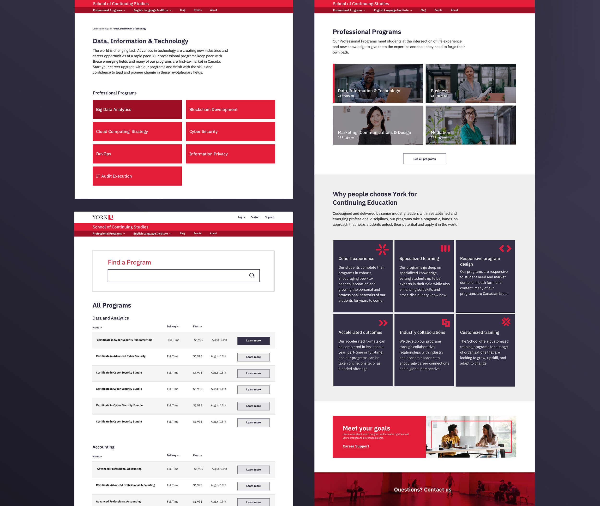
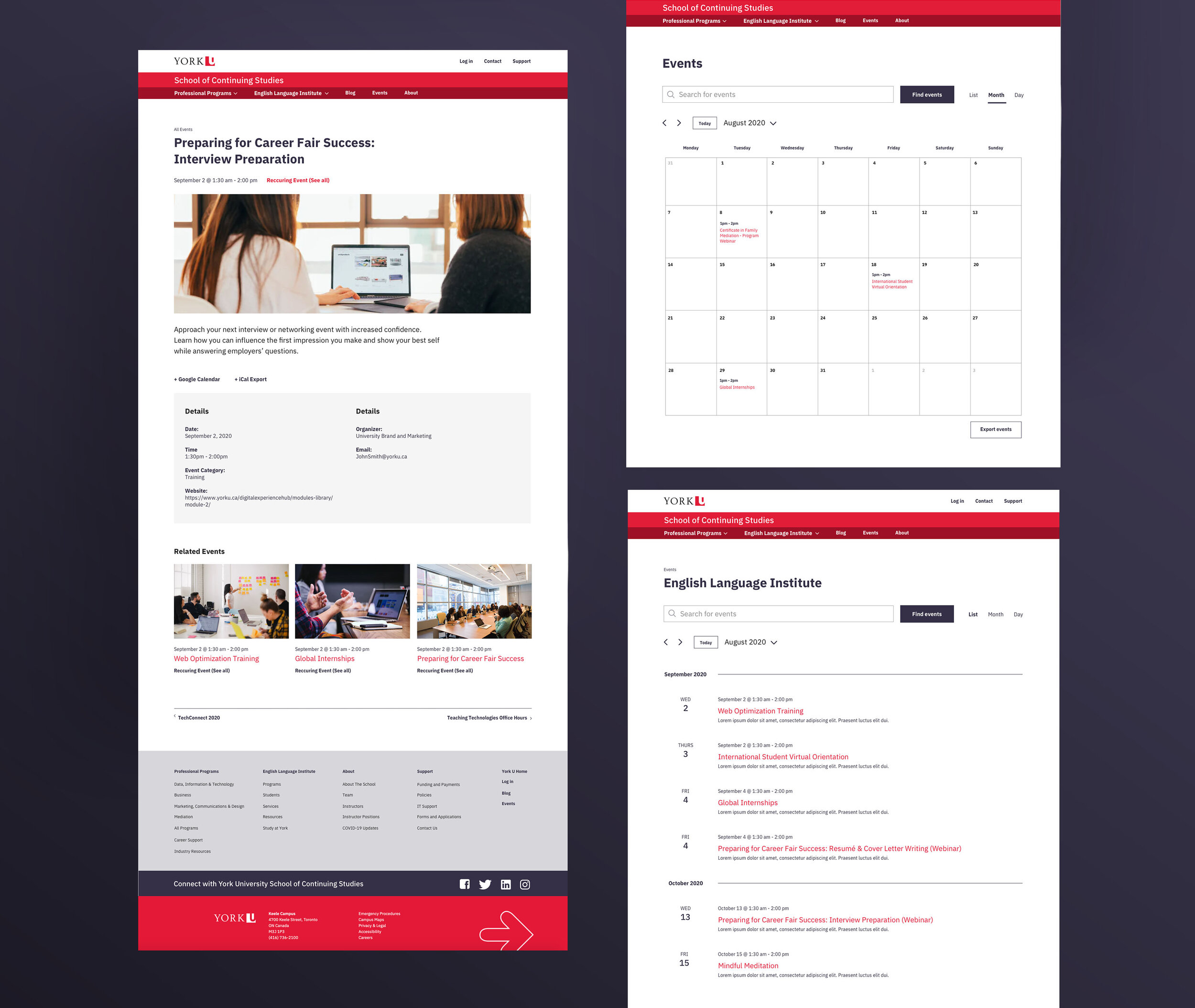
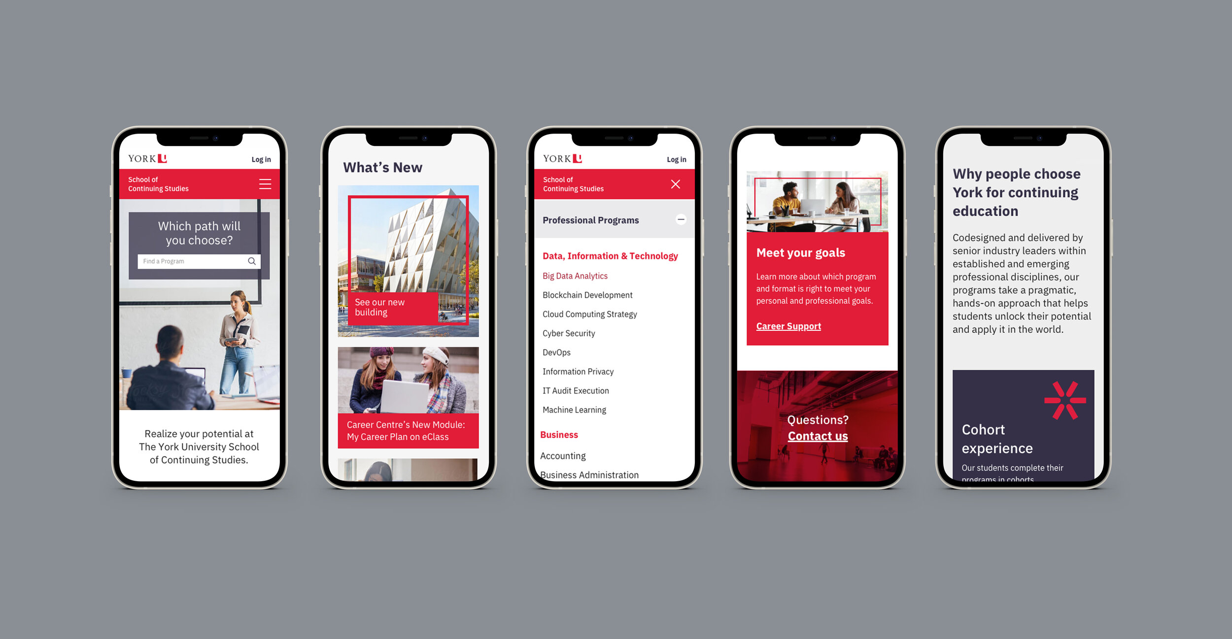
Balancing design and technical priorities from the University rebrand, we consulted with stakeholders within the school and York U as a whole to understand the range of users and scenarios. We then fully reimagined the digital presence for the school with a design system that puts the program offerings at the centre of the user experience. This included a powerful program search feature, drastically improved content management with flexible content modules, more usable program navigation, and conversion-oriented marketing landing pages.