

Applied Arts Design Awards 2017 winner
Red Dot Communication Design Award winner 2017
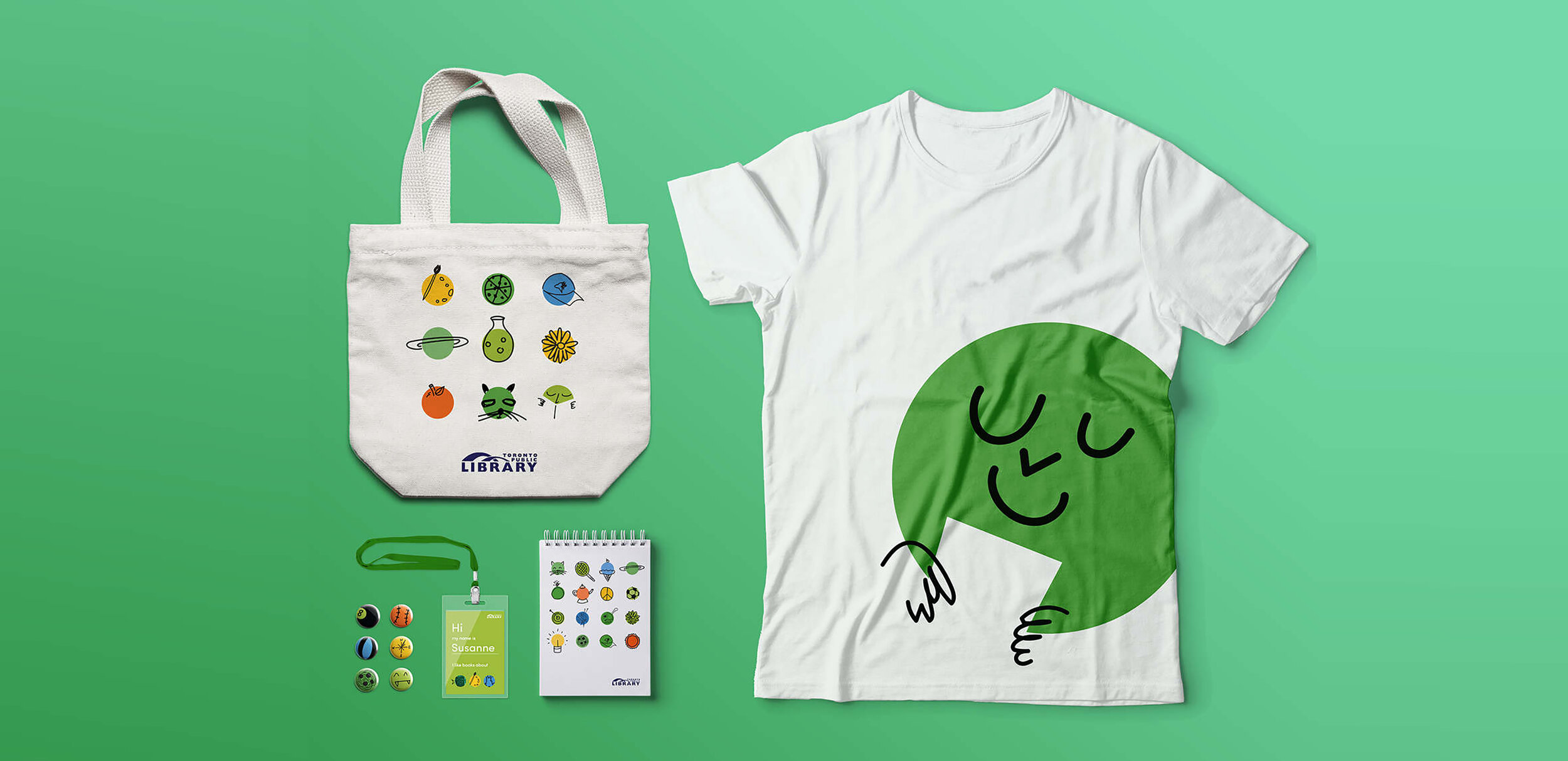
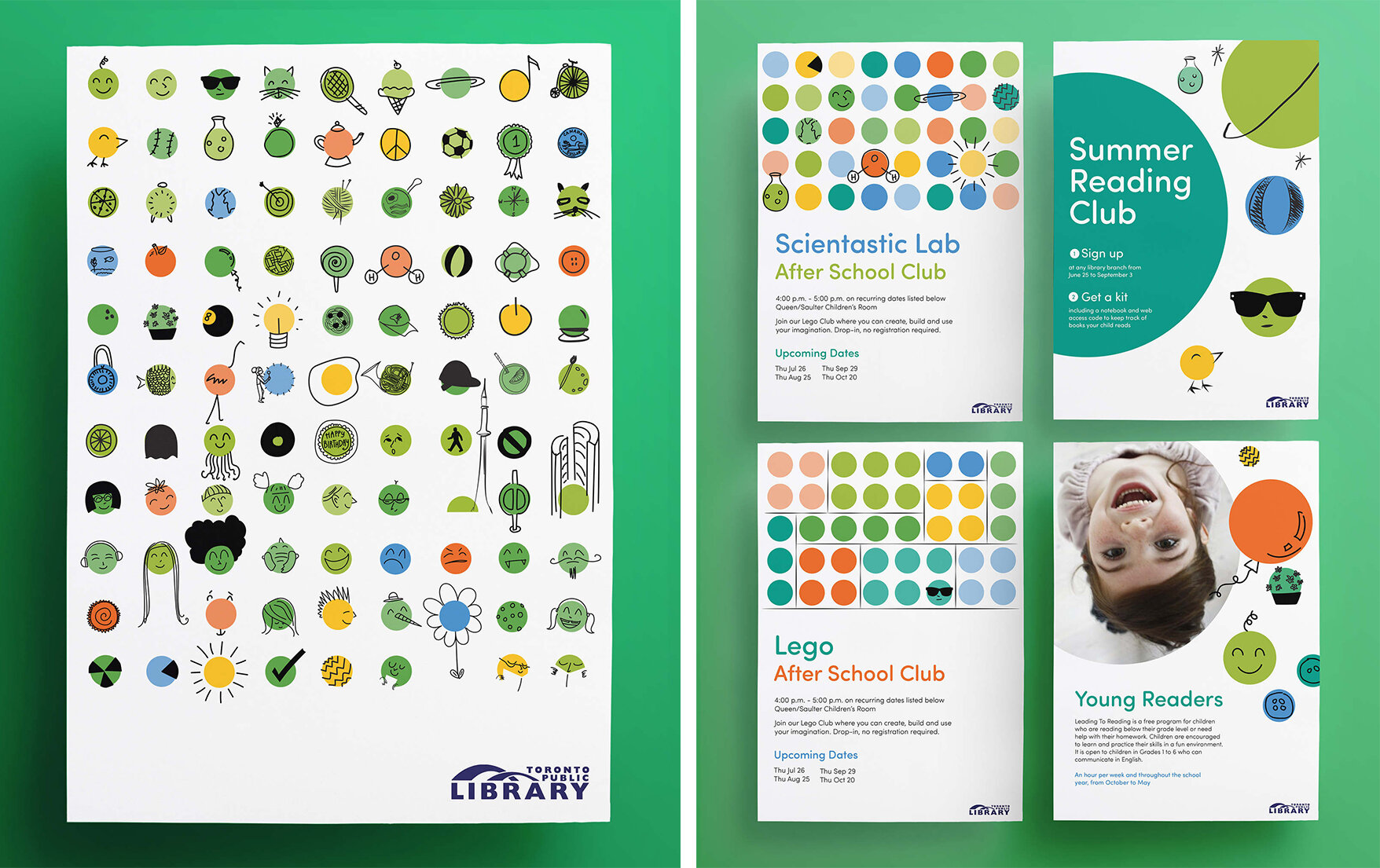
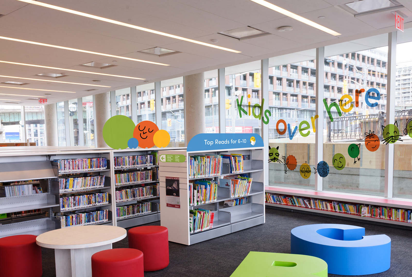
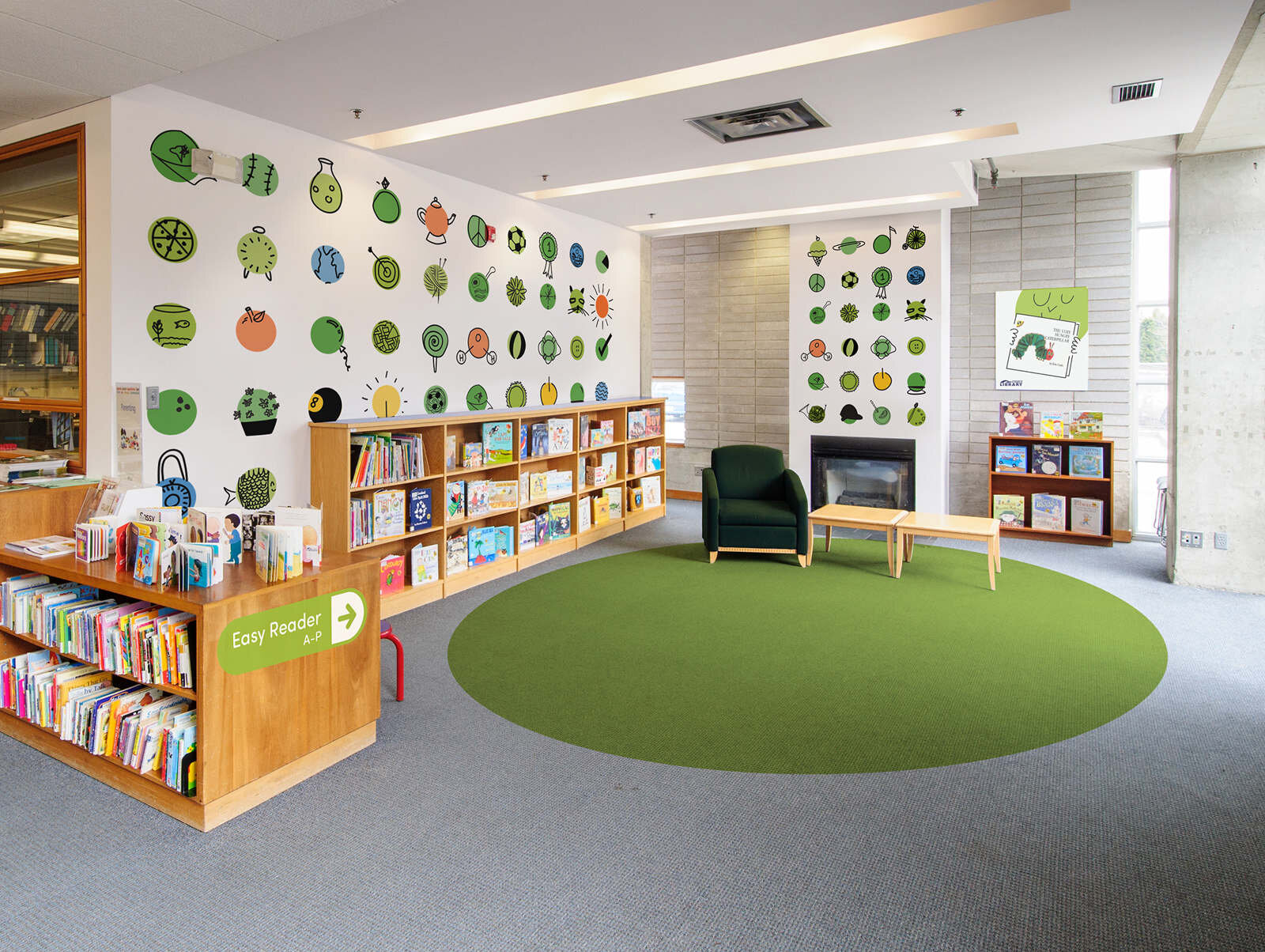
The Toronto Public Library is a big, beloved institution. The new identity for the Toronto Public Library children’s spaces and services creates a bold visual language that jumps out at kids across the institution’s 100 branches.
Focus groups with children to find out what they liked, what they didn’t and about the programs the library offered. Branches all over Toronto were visited to figure out what was already working, what needed to be improved, and what was feasible across diverse library branches.
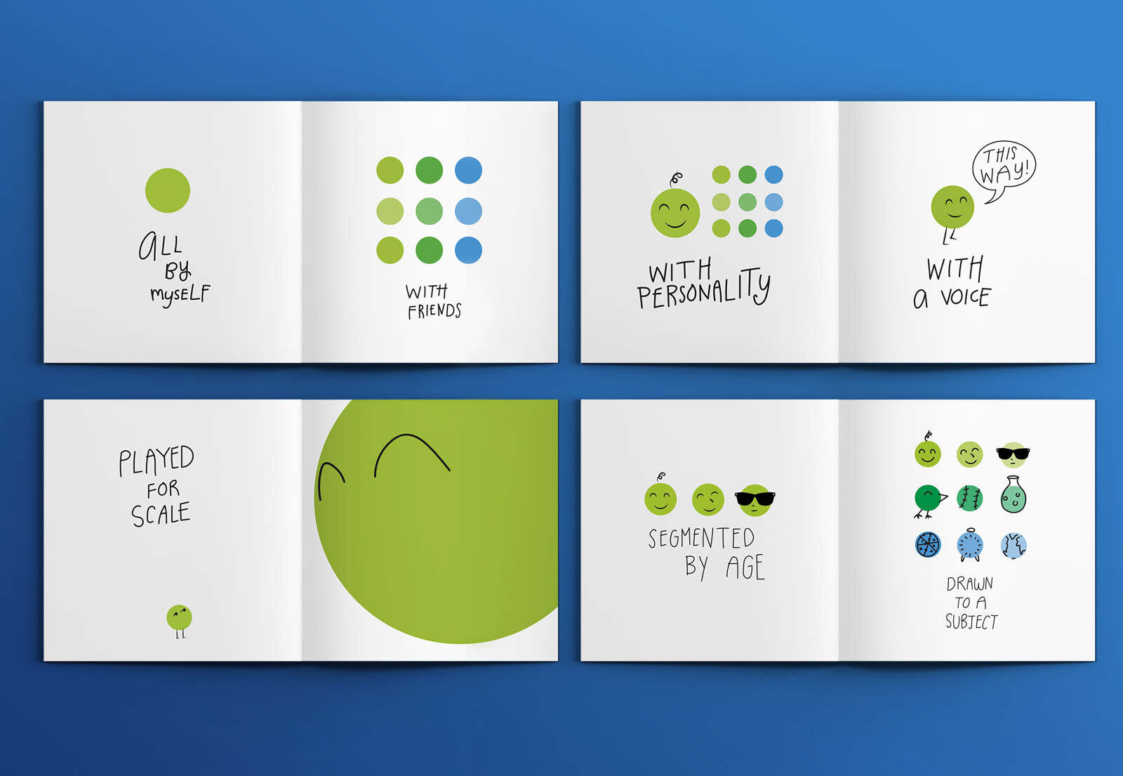
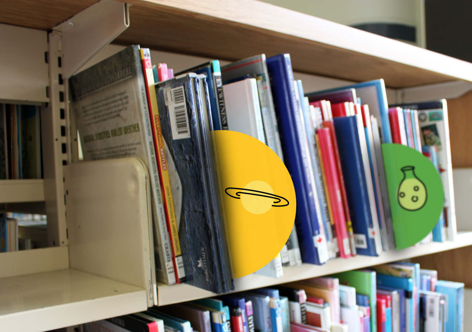
Green is for GO! The GO dot is a friendly green dot that can customize itself to any space, shape, occasion, or need. It’s fun, but it’s not just fun. As a visual marker, it’s a mark that lets kids play. The simple and flexible application of the GO dot allows it to be adapted across the library’s varied needs.